PS: you can do hyperlinks by highlighting the text you want, then pressing the little chain icon on the toolbar above where you type, and inputting the url you want it to link to there.
Agnates said:
PS: you can do hyperlinks by highlighting the text you want, then pressing the little chain icon on the toolbar above where you type, and inputting the url you want it to link to there.
Thanks for telling me. In IE it does it for me. Since I switched to Opera I was wondering how without having to do it via the HTML

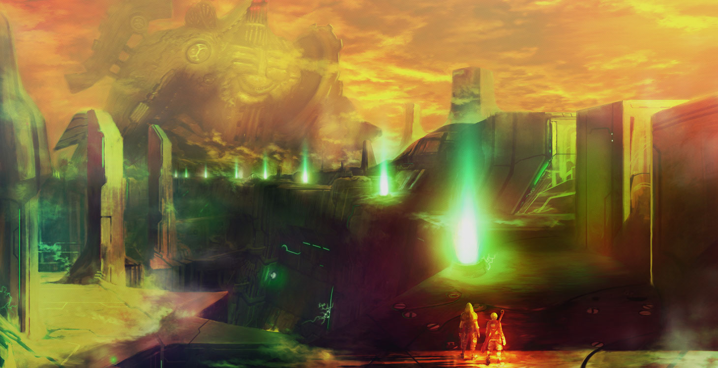
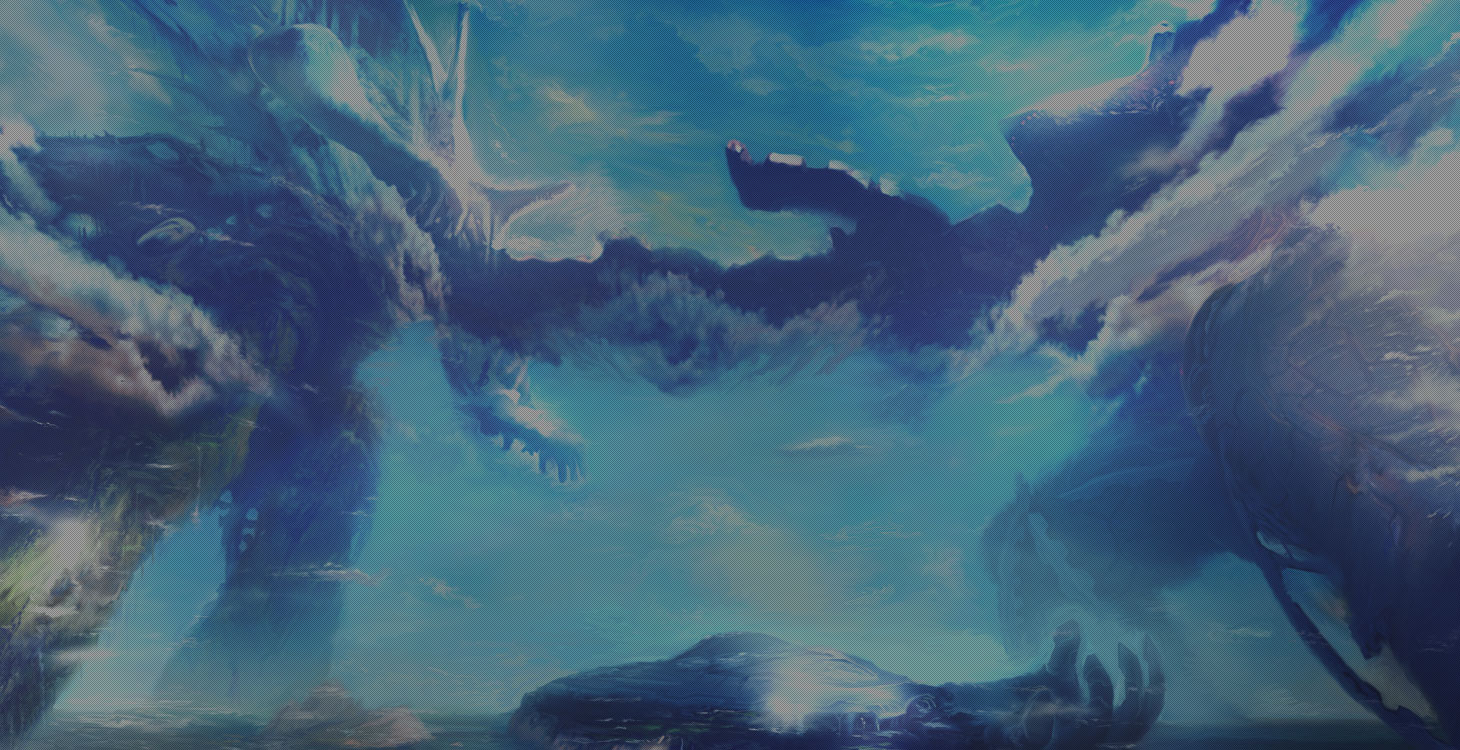
i think these are beautiful.
are all these screens from the intro about the conflict between the two deities?
Sweet, can't wait. Low res textures and crude models galore but it has an undeniable charm with the world design and scale. Looks like the scans.
Yeah the wide shots look great, but close up there is some bad texture work, especially on characters. Wonder why they didn't just do the cinematics like Disaster, using the models and environments but sprucing it up. The scale of everything is incredible for wii.
It looks like the engine was built for scale and everything is meant to be viewed with the camera zoomed out like the E3 2009 video. Then when the camera gets zoomed in, not so hot. Almost Dreamcast like.

From what I played of Crystal Bearers the environments in Xenoblade look several times, maybe more, larger in scale. I think that Xenoblade, close up looks shabby. They should have a different cutscene engine. I don't like when games use FMV or drastically different looking cutscenes from the in game graphics but you can take in game models and environments, direct and animate them a bit better in cutscene form.
The start of that video had me wowed at the vistas and monster animation and then vomiting at the inside of someone's low res house.

Oh, I thought the animation was a joke in Xenoblade btw, look at that horse...thing... It's lol worthy. But it's better in the characters. Though I prefer in-game than CG scenes even if they're in the same overall style, like in Red Steel 2.
Anyway, my guess is they didn't even have money to hire a good CG studio. Doesn't seem like Nintendo funds and backs Monolith Soft games fully, what with this and Disaster, but it's not like sales would justify it.
I really hate the beach section in TCB. It's so ugly.
Graces looks good, but its cel-shaded so it doesn't need the same resources as doing a realistic style right?
I like the animation of the monster in the Xeno trailer. Wish I could watch that Graces footage but I'm trying to view another video and its taking an age to load.


Agnates said:It's not cel shaded and no, it's a myth that it needs less resources. If anything, when it's done properly, the cel shading is an extra effect on top of normal rendering, so it could well need more. But ToG isn't cel shaded, the rendering is normal.
It's a very simple style though.

Really doubt it uses as much resources as this.

It would be like comparing Metroid Prime 3 to Red Steel 2. Both are 60 FPS but I know which one is pushing it more.


Anyway, screens don't do it justice, you can see some nice complex cities and such in the trailer, or the smooth looking dungeons and what not, even if the characters are simpler than TCB.
RS2 is cruder and blockier than MP3, it's not the cel shading that makes it so, it's their inability to make a better engine that handles more geometry. It's their design. So, yes, blocky and crude design (which I don't think applies to ToG's environments) needs less resources, that's obvious, but independent to cel shading. You could have the detail of MP3 and cel shade it if you had capable programmers and artists (or like Borderlands does have more detail). They didn't. But at least they had proper shadows both in the environment and the characters and all the breakables which MP3 doesn't have I guess. Of course, its world design is miles ahead.
A new part of the "world" section on the official site has opened. It has a running loop video of various locations and settings in the game, including stuff that wasn't in the new trailer.
- duckroll

Agnates said:You could have the detail of MP3 and cel shade it if you had capable programmers and artists (or like Borderlands does have more detail). They didn't. But at least they had proper shadows both in the environment and the characters and all the breakables which MP3 doesn't have I guess. Of course, its world design is miles ahead.
Oh yeah, completely agree, I see what you are saying now.
It's how simple they choose to make it. I think in the past cel-shading had the benefit of making more stylised visuals - that still looked good, yet didn't have to really push the machine as much as a detailed realistic game would.


I guess I should be updating this thread more often.
Music from website:
http://www.youtube.com/watch?v=XX9sB7CXQ3U
Official website trailer@
http://www.nintendo.co.jp/wii/sx4j/trailers/index.html
Youtube version:
http://www.youtube.com/watch?v=UhnZBahIOi4&feature=player_embedded